|
[Extracted from ActiveState Komodo 3.5 documentation]
Komodo's GUI Builder is an application used to create simple graphical
user interfaces, such as dialogs containing radiobuttons and listboxes. The
GUI Builder supports building applications using Tk with extended widget
sets (depending on the language) that includes
BWidgets
and
IWidgets.
The GUI Builder is integrated with Komodo via dialog projects,
which consist of a top-level container (with the extension ".ui") and
program files that contain the GUI code and the application code.
GUI Builder projects are referenced as "dialog" components within Komodo
projects or the
Toolbox. To create a new dialog
project, right-click a project name or a folder within a project and select
Add|New Dialog. Alternatively, select
Project|Add|New Dialog or Toolbox|Add|New Dialog
from the drop-down menu. Provide the following information about the dialog
project:
- Specify Dialog Project File: The files related to the
dialog are stored in a project file with a ".ui" extension.
- Specify Target Language: The GUI Builder can generate
code in various languages and language versions:
- Perl/Tk (8.0)
- Perl/Tk (8.4)
- Perl/Tkx (8.4)
- Ruby/Tk (8.3)
- Ruby/Tk (8.4)
- Tcl/Tk (8.3)
- Tcl/Tk (8.4)
- Python/Tkinter (8.3)
- Python/Tkinter (8.4)
- Click OK. The GUI Builder application loads.
Use the GUI Builder to configure the dialog, as described in the sections
below.
When you save a new dialog in the GUI Builder, the following items are
created in either the Toolbox
or the Project Manager
(depending on where the New Dialog command was invoked,
where "Dialog" is the name of the project, and "<language>" is the
standard language suffix):
- Dialog.ui Project File: The name specified
for the dialog is suffixed with ".ui" and stored with utf-8
encoding. This dialog project file contains two files:
- Dialog.<language>: Callback file
with user editable code sections, stored in the default system encoding.
Edit this file to add functionality to widgets. This is the file to
launch to create the interface.
- Dialog_ui.<language>: UI creation
code file, stored with utf-8 encoding. This file creates the structure
of the user interface, and is loaded by the callback file. It is not
intended to be edited by the user. Any changes to this file will be lost
the next time the project is saved.
To modify the graphical properties of the dialog, right-click the dialog
project (with the ".ui" extension) and select Edit Dialog.
This launches the GUI Builder and loads the project. Code within the sections
described in Adding Code to a
Dialog are not affected by modifying the graphical properties of a
dialog.
To modify the functions within the dialog, open the
Dialog.<language> file (callback file), located beneath the
dialog project file. Open the callback file by selecting Open
File on the Projects context menu, or by
double-clicking the filename on the Projects tab.
Comments included in the callback file indicate where to insert callback
code and user code. The GUI Builder parses this file on regeneration, so
only code entered within particular sections is preserved. The sections
are the matching BEGIN/END USER CODE blocks and the following
parts for each particular language of the BEGIN/END CALLBACK
CODE block:
- Perl:
sub sections
- Python:
def sections
- Ruby:
def sections
- Tcl:
proc sections
The callback file is generated in such a way as to instantiate an
instance of the dialog when it is launched. If a function named
userinit is defined (e.g., in the USER code
section), it will be executed prior to instantiating the dialog. If a
function name run is defined, it will be executed following
instantiation of the dialog, prior to entering the Tk main loop. The code
generation uses the following style for each language:
- Perl: The package
Dialog is
used to encapsulate data. Dialog::ui is a reserved
subroutine name for the UI creation code. Names of widgets are package
variables. USER code has one section.
userinit and run may be defined in the
Dialog namespace.
- Python: The class
CustomDialog
is used for the dialog object in callback code, deriving from the
Dialog class, used for UI creation. Names of
widgets become attributes of the Dialog class.
USER code has global and class
sections. userinit and run may be defined at
the global scope.
- Ruby: The class
Dialog is used
for the dialog object in callback code, deriving from the
Dialog_ui class, used for UI creation. Names of
widgets are class instance variables. USER code has
global and class sections.
userinit and run may be defined at the global
scope.
- Tcl: The namespace
Dialog is
used to encapsulate data. Dialog::ui is a reserved
proc name for the UI creation code. Names of widgets are namespace
variables. USER code has one section.
userinit and run may be defined in the
Dialog namespace.
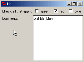
- To run the application, click the green arrow button on the
toolbar, or select
Commands|Start Test.
- To stop a running application, click the red stop button on the
toolbar, or select
Commands|Stop Test.
When you save the GUI in the GUI Builder, corresponding dialog project and
language files are created in Komodo, either in the
Project Manager or the
Toolbox, depending on where
the New Dialog command was invoked.
To display the code in the Komodo editor, select Commands|View
Code. Alternatively, in Komodo, open the Dialog.<language> file
beneath the dialog project.
Dialog projects consist of a "container" file (with the extension ".ui")
and the source files containing the code for the GUI and the code for the
application. Options for dialog projects are described below; options for
files contained in dialog projects are the same as options for regular
files.
To access options for the selected dialog, do one of the following:
- Toolbox|dialog_name|option or
Project|dialog_name|option: When a
dialog is selected in the Project Manager or Toolbox, use the
Project or Toolbox drop-down menus to access
the list of options. The name of the dialog currently selected
in the Project Manager or the Toolbox is displayed in the drop-down menu.
- Context Menu: Right-click a dialog in a
project or the Toolbox and select the desired option.
The following options are available:
- Edit Dialog: Use this option to launch the GUI Builder
application.
- Test Dialog: This option runs the application.
- Refresh Status: This option checks the read/write disk
status of the dialog project file. If the dialog project file is stored in a
source code control system,
Refresh Status also checks the repository status of the
file.
- Cut/Copy/Paste: These options are used to remove the
dialog from a project or the Toolbox, or to move dialog projects between
the Project Manager and the Toolbox (and vice versa).
- Export as Project File: When this option is invoked,
a new project file is created that contains the dialog from which the
option is invoked. You are prompted to provide the name of the new project
file and the directory where it is stored. To open the new project file,
select File|Open|Project.
- Export Package: Dialogs can be archived and
distributed among multiple Komodo users via "packages". Packages are
compressed archive files that contain the dialog from which the
Export Package option was invoked. Packages are stored in
files with a ".kpz" extension, and can be opened by any archiving utility
that supports
libz (for example WinZip). The Export
Package option differs from the Export as Project
File option in that copies of filesystem-based components (such as
files and dialog projects) are included in the archive. Conversely,
Export as Project File creates a project with a reference to
the component's original location and does not create copies of the components.
When Export Package is invoked, you are prompted for a name
and file location for the package. Exported packages can
only be imported into "container" objects in Komodo, such as projects, the
Toolbox, and folders within projects and the Toolbox. See
Toolbox - Exporting and
Importing Toolbox Contents,
Projects - Importing
and Exporting Projects via Packages, or
Folders - Import Contents
from Package for more information.
- Source Control: If Komodo is configured to work in
conjunction with a Source Code Control
system, this option is used to access SCC commands for the dialog project
file.
- Source Control on Contents: If Komodo is configured
to work in conjunction with a Source Code
Control system, this option is used to invoke SCC commands that
operate on the contents of the dialog project.
- Delete: To remove a dialog from a project or the
Toolbox, select this option. The dialog project (and the files it contains)
is not deleted from disk.

Quick Overview
- Add rows and columns by double-clicking grid lines.
- Resize cells by dragging the grid lines.
- Drag and drop widgets from the Palette tab to a cell
in the workspace.
- Double-click widgets in the workspace to configure their properties.
- Use the Menu tab to create menus and add menu item
widgets.
- Select Edit|View Menus or press 'Ctrl'+'M' ('Meta'+'M'
on Mac OS X) to show or hide menus in the workspace.
- Use the Dialog tab to manage the structure of GUI
Builder projects.
- Use the Menu tab to add cascading menus and menu
items.
- Click the green arrow button on the toolbar or select
Commands|Start Test to test the interface.
- Save the GUI to create the files in Komodo.
Limitations
- There are numerous "container" widgets available for building UIs
in the GUI Builder that vary depending on language. These include
frame, notebook and panedwindow, among others. The only "container"
widgets that GUI Builder supports in full are the core frame and labelframe
widgets. Placement widgets inside the other "container" widgets must be
done by hand currently.
- Specification of the dialog title must be done in the user code.
- The GUI Builder does not check whether you have the requisite Tk
installation and associated widget modules (if necessary). This
means you may be able to create UIs that you cannot actually
test.
- If you create widgets, generate code, and later rename or remove
those widgets, any generated command code for those widgets is not
removed. This is because the round-trip code generation doesn't know
about what has been deleted, just what currently exists, and
pre-existing code is just parsed and reinserted.
The workspace is used to design the GUI.
See Adding and Resizing Rows and Columns and
Adding Widgets to a Dialog for more about
using the GUI Builder workspace.

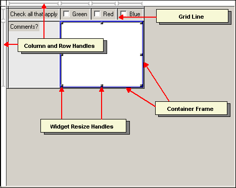
The column and row handles at the top and the left of the workspace indicate
the selected cell. When a cell is selected, the column and row handles are
displayed in blue. When a single column or row handle is selected, it is displayed
in red. Use the Appearance Preferences
to set color and size preferences for the workspace.
The toolbar contains buttons for the most common widget configuration
options. You must select the widget in the workspace or on the
Dialog tab
before changing widget properties. For a description of how to use the
toolbar buttons to configure basic widget properties, see
Configuring Widget Properties.

From left to right, the tools are:
 |
Save file |
 |
Widget text |
 |
Widget text size |
 |
Widget text bold and italic |
 |
Widget text alignment |
 |
Widget foreground and background color |
 |
Widget position in cell |
 |
Widget border and relief |
 |
Widget orientation (for the scrollbar widget) |
 |
Widget delete |
 |
Run or stop running interface |
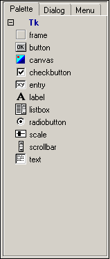
Perl/Tk 8.0 Palette tab
|
The Palette tab is the tab displayed by default in
the GUI Builder. Its contents vary depending on the language that was selected
when a dialog was added to the
Toolbox or
Project Manager. For more about
language selection, see Creating
Dialog Projects.
Use the Next Widget and Previous Widget commands
on the Navigate submenu to move from one widget to another in
the workspace.
Properties vary according to the selected target language. Select
File|Project Settings to view the selected target language.
- To change the properties of an individual widget, double-click the
widget in the workspace.
- To change the default properties for a widget, double-click the widget
on the Palette tab.
The settings available in the widget properties dialog box vary depending on
the type of widget that is selected.
|
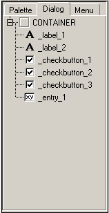 |
The Dialog tab provides a hierarchical overview of a
GUI Builder project. As you add controls and menus to the workspace, a structured
outline of the chosen widgets is displayed on the Dialog tab.
The contents of each project are displayed beneath a collapsible "Container" node
that appears at the top of the tab. Double-click widgets on the Dialog
tab to view or edit their properties.
Use commands on the Navigate submenu to determine the relationships
between widgets. Select Navigate|Select Parent to highlight the parent
element of a selected widget. Select Navigate|Select 1st Child to
highlight the widget that is one level below the selected element in the project
hierarchy. Note that these commands are only available if you select a widget that has a
"parent/child" relationship with one or more other widgets. |
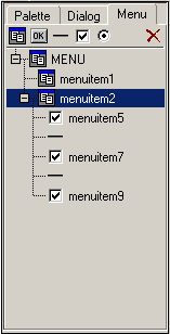 |
Use the widgets on the Menu tab to add cascading
menus and menu items to a GUI.
Just as the Dialog tab provides a hierarchical
overview of the controls and buttons in a dialog, the Menu
tab displays the menus and menu options that make up the menu bar in a GUI
Builder project. Select Edit|View Menus to display the menus
at the top of the workspace. The available menu widgets are (from left to right)
"cascade", "command", "separator", "checkbutton", and "radiobutton". For
directions on adding menu widgets to the workspace, see
Adding Widgets to a Dialog.
Add drop-down menus and menu items to your GUI using the widgets on the
Menu tab. Select Edit|View Menus to display
menus in the workspace. |
The status bar displays warnings, progress messages and diagnostics.
Help messages are displayed only if Show Statusbar Help is
selected in GUI Builder Preferences.
Help messages are displayed for the object under the current cursor position.
In addition, when you drag a widget or resize handle, the status bar displays
the grid position or size.

When you launch the GUI Builder, the
workspace contains a default grid with
two rows and two columns. You can create a new dialog with this default grid, or
modify the default grid using the options described below.
To add rows and columns:
- Add a Row or Column: Click on a grid line, then
press the 'Insert' key. Alternatively, double-click the grid
line.
- Add a Row and a Column: Click in a grid cell, then
press the 'Insert' key.
To delete rows and columns:
- Delete a Row or Column: Click on a grid line, then
press the 'Delete' key. Rows and columns cannot be deleted if
they contain widgets.
- Delete a Row and a Column: Click in a grid cell,
then press the 'Delete' key. Rows and columns cannot be deleted
if they contain widgets.
To resize rows and columns:
- Configure Row and Column Size, Weight and Widget Padding:
Click in a grid cell, then select Edit|Row & Column
Properties. Use this dialog to change size, weight and the padding
around widgets.
- Resize Row or Column: Click and drag a grid line.
To straddle rows and columns:
Grid cells can be resized to span multiple columns or rows. Note that
straddling rows and columns is only possible when the grid cell that you want to
expand contains a widget, and the adjacent cells do not contain widgets. To
straddle rows or columns:
- Click to select the cell containing the widget.
- Position the cursor over one of the resize handles. The cursor changes to
an arrow pointing towards a line.
- Click and drag across the adjacent cells.
To add widgets from the Palette tab:
- On the Palette tab, click the desired widget,
drag it into a cell in the workspace.
To add widgets from the Menu tab:
- Click the MENU container on the Menu
tab or, if Edit|View Menus has been selected, click
New Cascade at the top of the workspace, to add a new
menu to the GUI.
- Select a top-level "menuitem" on the Menu tab to make
the Menu widgets available. Use the "cascade", "command", "separator",
"checkbutton", and "radiobutton" menu item widgets to create menus.
To remove a widget or menu item from the workspace, select it and click
the "delete" button on the toolbar for widgets,
or click the "delete" button on the Menu tab
for menu items.
Basic Widget Properties
- Select the widget in the GUI Builder workspace. The associated options
become available on the toolbar.
- Use the controls on the toolbar to edit widget properties.
Advanced Widget Properties
- Select the widget in the GUI Builder
workspace,
then double-click it or select Edit|Widget
Properties to display a widget properties dialog box.
The generated code for all widget properties except command properties
stores the values in double quotes (""). This
allows for the interpolation of \ escape sequences, but
may require escaping certain special characters in your values. You may
add unicode text, which will be translated for portability as follows:
- Perl:
\x{XXXX} per unichar
- Python:
\uXXXX per unichar in
unicode (u"") strings
- Ruby:
$KCODE='u' is set and the UI
creation code file is written in utf-8 encoding.
- Tcl:
\uXXXX per unichar
If you do not want a widget property to be quoted, then prefix the value
with [[=]]. This indicates to the code generator that the
value should be exactly what follows that marker. No other quoting,
escaping or stripping of whitespace will be done, so be sure to provide
contextually correct code following the marker.
- To make a widget resizable, click the column or row handle once to
select, then again to toggle the resizable setting. When the arrows on
the handle point outwards, the widget becomes resizable. Note that this
characteristic only has an effect if the widget is configured to adhere
to two (or four) sides of the cell. (The scrollbar widget is resizable
by default.)
- To make a widget span rows or columns, point the mouse at the edge of
the widget and drag the widget resize handle when the mouse pointer
changes (grid lines spanned by the widget disappear).
- To attach scrollbars to widgets, first insert the desired widget and
scrollbar in the workspace. Then select the widget, and select
Commands|Attach Scrollbars. You are prompted to
specify which scrollbars you wish to attach. Scrollbars can only be
attached to scrollable widgets.
- Load Project Into Frame: This option becomes available
on the Commands menu when a "frame" or "labelframe" widget is
added to the workspace. Select Commands|Load Project Into Frame
to navigate to a GUI component contained in another GUI Builder project (.ui)
file, and then load it into the selected frame. This feature is particularly
useful if you have an interface component that you want to insert repeatedly
in your GUI projects.
- Insert if widget dropped on gridline: If this option is
enabled, a widget is automatically inserted in a new row or column when you drop
the widget on a grid line. If this option is not enabled, the GUI Builder
ignores widgets dropped on grid lines.
- Confirm saves before test: If this option is enabled,
you are prompted to save changed files before
testing the application.
- Confirm widget delete: If this option is enabled, you
are prompted to confirm that you want to
delete a widget in the
workspace.
- Autosave on quit: If this option is enabled, changed
files are automatically saved. Otherwise, you are prompted to save
changed files.
- Mouse Gravity: This setting determines how far the mouse
pointer must move to invoke the action. Set the value lower to make the mouse
more responsive and higher to give the mouse more tolerance.
- Show Tooltips: If this option is enabled, yellow pop-up
hints are displayed whenever you hover the mouse pointer over an object.
- Show Statusbar Help: If this option is enabled, usage
tips are displayed in the bottom right corner of the GUI Builder window.
- Selection Color: When a widget or grid line is selected
(by clicking on it), it is outlined in the color specified here.
- Grid Background: This setting specifies the color of
the grid background.
- Active Over Color: When you hover the mouse pointer over
a grid line, the line changes to the color specified here.
- Frame Background: Set the color for the background
of the frame widget.
- Show Grid Lines: If this option is enabled, grid lines
are displayed. Alternatively, click the button at the intersection of
the row and column handles (top left corner of the workspace) to toggle grid
lines on and off.
- Grid Line Thickness: Set the thickness of the grid line.
- Default Grid Spacing: When you create a new GUI, cells
are created by default with the pixel size specified here.
- Control Points Size: Set the size of the Widget Resize
Handles.
Reference pages for individual widgets are included in the ActiveTcl
documentation. Select Help|Help for Languages to access
either a local version (if installed) or web version of the ActiveTcl
documentation.
"Tk" is a toolkit for building graphical user interfaces. It was originally
developed for Tcl, but has since been adapted for Perl, Python, Ruby and
other languages. The
ActivePerl, ActivePython and ActiveTcl language distributions include
documentation regarding each language's Tk support. (Note that the Tcl/Tk
reference is divided into three categories: the core (Tk) manual and two
groups of extensions (BWidgets and IWidgets).
Select Help|Help for Languages to launch the local
version of the language documentation (if installed) or to access the web
version. Links to the language-specific Tk reference pages are provided below:
|

